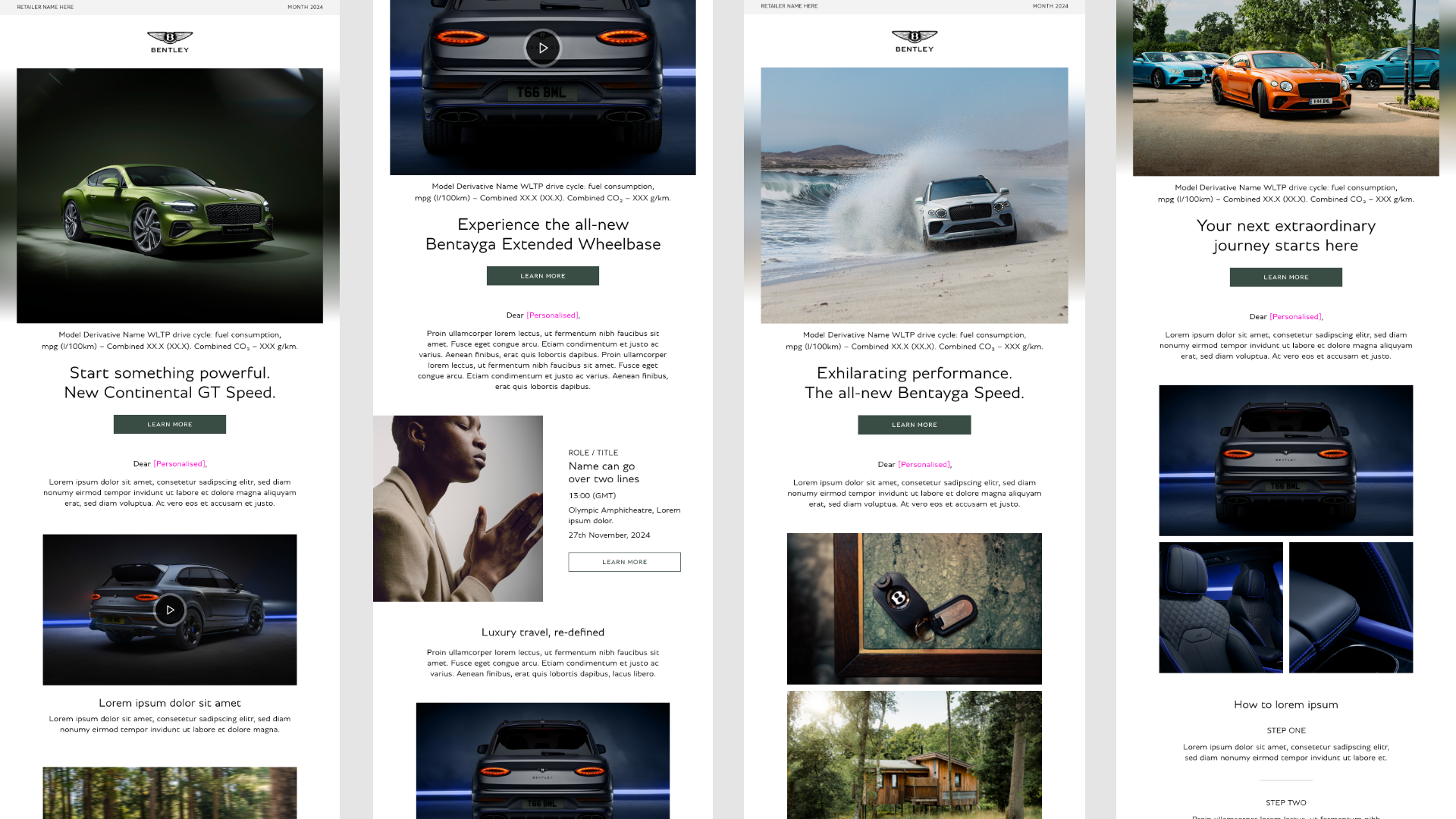
Bentley email template
In 2024, Bentley updated its website after IPG-X honed the brand’s look and feel. Bentley’s email template desperately needed some craft and care to bring it in line with the rest of its CI, so I created a modular template that would work for the long-term.

The BRIEF:
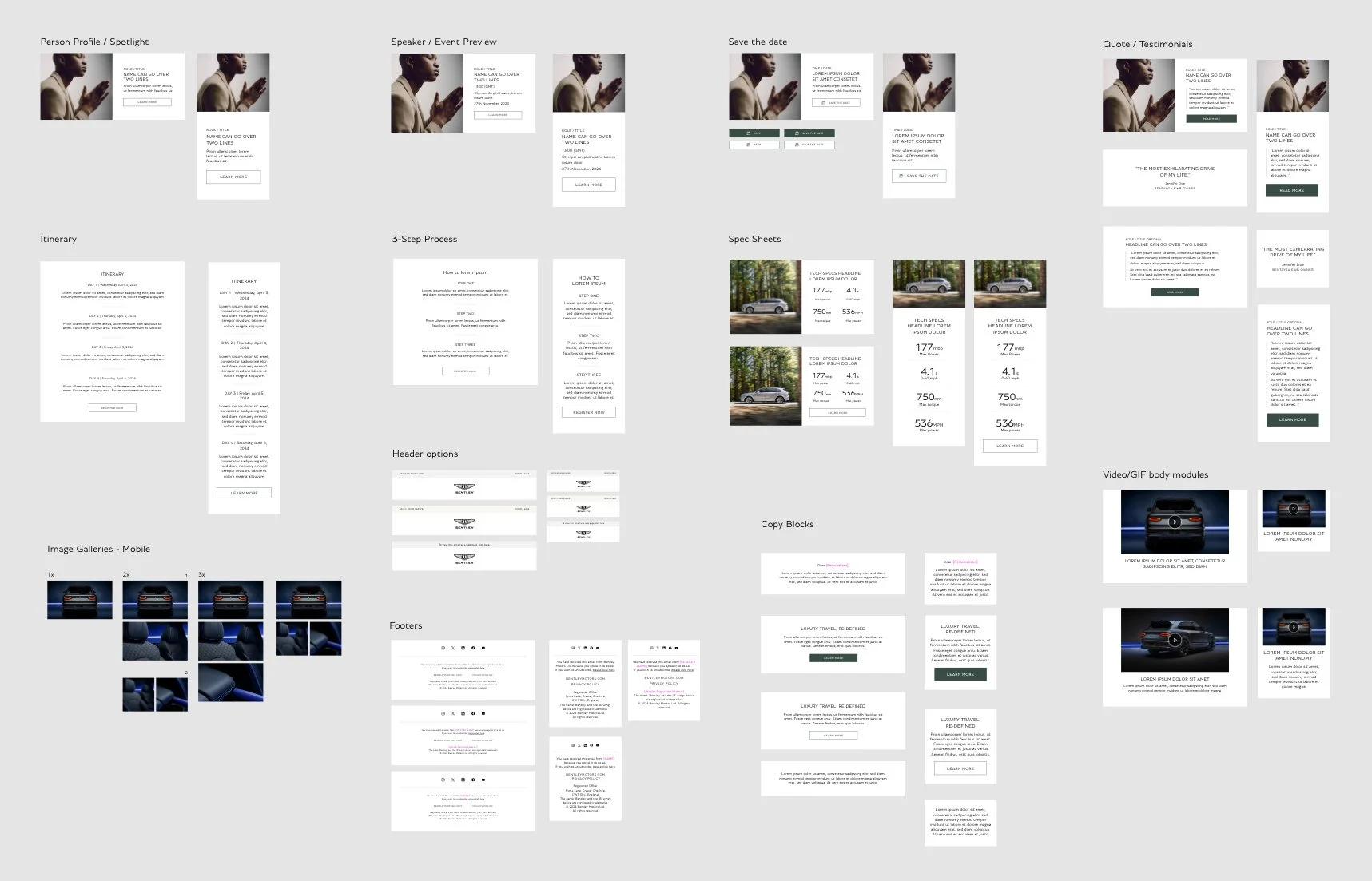
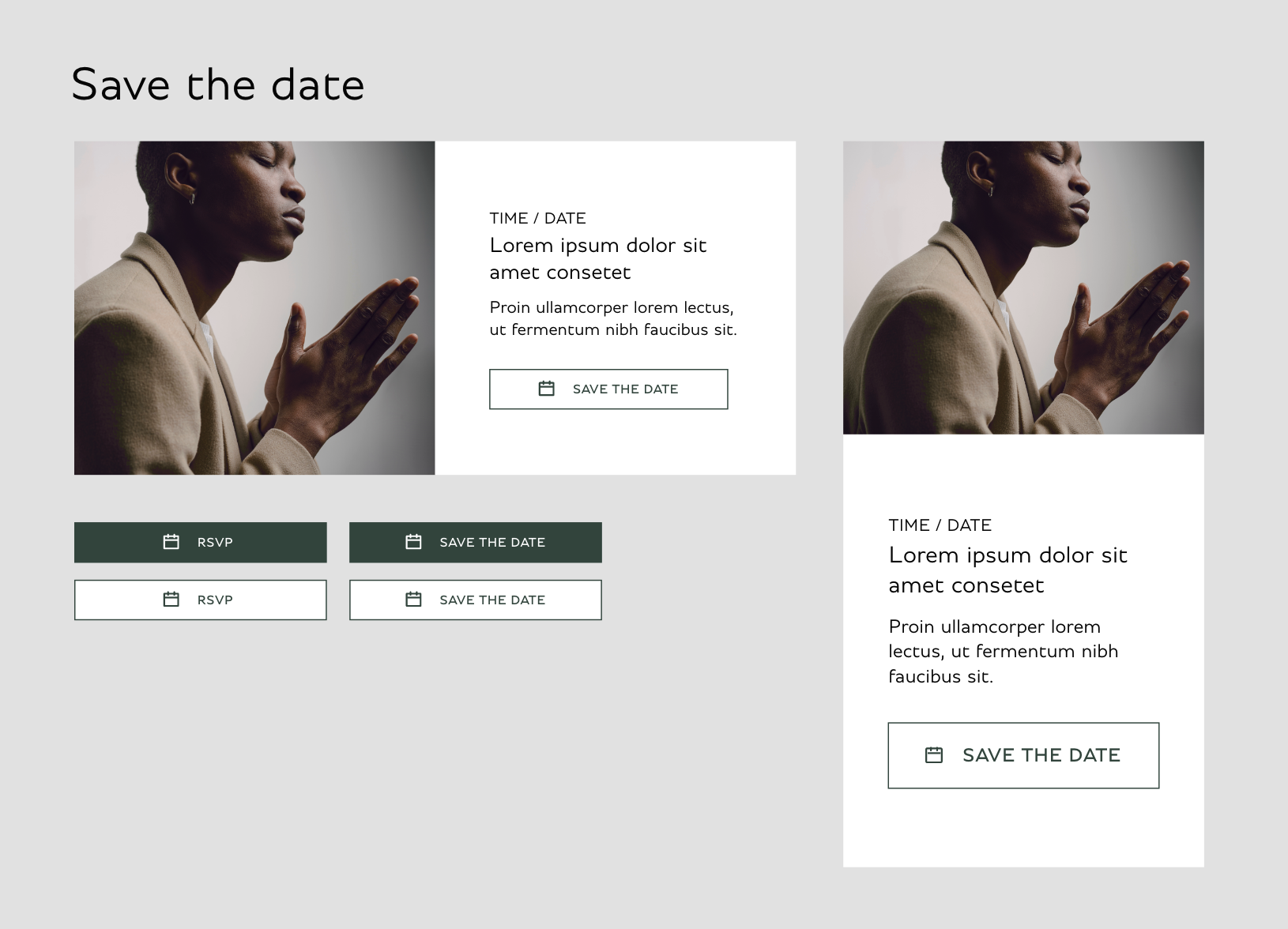
Bentley needed a responsive, modular template that would accommodate a wide variety of content types - allowing for flexible communication options.
The client also needed me to oversee development and testing, as well as deliver a user guide for the brand to carry forward into the future.
The approach
It all started with a component list from Bentley - but I knew upfront I wouldn’t be stopping there.
I’d been designing their eDMs since we won the account, all based on a 2020 template we’d inherited. By the time the redesign brief landed, I’d already clocked what wasn’t working - and what just looked a bit... well, shit!
Laughable line lengths. Fonts too small to read, even on desktop. Full-width images wrecking the flow. Clumsy spacing. No real visual cues between callout content like event listings. It wasn’t just dated - it was hard work to scroll through.
I’d already built custom layouts to tackle more bespoke needs where no component existed. So when the chance came to rework it properly, I was ready.
I’d been itching to get stuck into this one.
Page from Bentley's email guidelines showing progression from 2017 to present.
Solid foundations
I worked with the client to agree upon some rules that we could move forward with.
A big one for me was the (frankly egregious) word count - which the client was equally keen to cut down!
I set up a grid system that components could adhere to, while still allowing enough flexibility for certain rules to be broken.
I designed elements that were purposefully full width to create natural page breaks, while delivering important information - focussing on function, form and craft at every step of the design phase.


Header image template
I made a header image template in Photoshop, which used a smart object that worked over two layers - meaning a user could update the main image and quickly crop it inside a pre-set mask, then scale the blurred image behind (which has also reflected the newly updated smart object) to fill a partially masked layer to create a transparency effect.
The columns either side had been measured to precisely match the grid used throughout the template. The completed header image also scaled perfectly into the mobile grid too.
To tell you the truth, I wish I could’ve been a little bit bolder with the header imagery - and this is really where that idea of “digital negotiation” comes back into play (mentioned in the last section of my IPG-X Website Case Study).
The header on the Bentley website has a blurred background that goes to the top of the page and behind the logo. Replicating it on an email is tough, though. Layering elements on email is a no-go, and the logo colour will be affected by whether or not the device is in light or dark mode.
This also meant that we had to avoid full colour layouts too. So I developed a blur effect that created a seamless blend between the header bar, the image and the rest of the layout
A focus on mobile
I paid special attention to every aspect of the design when it came to mobile. Adhering to the established grid, testing type sizes on multiple device previews, and ensuring that buttons are a user friendly size. Something I learned from my former Head of Digital was to be conscious of “fat thumbs.”
This was something else that I didn’t like about the existing Bentley email template - button sizes were really thin on mobile. It felt like a basic oversight when considering accessibility and I wanted to address it.
I was also acutely aware of working with an acceptable amount of lorem ipsum copy; noting that line lengths and paragraph blocks need to consider a character count that can work with the amount of breathing room I’ve allowed the copy on both mobile and desktop.

Brain power
I worked with a delightful developer called Ellie Brain, who helped bring Bentley’s new email template to life.
Her attention to detail and enthusiasm made all the difference in working towards our aim of delivering an email template that we both regarded as “bulletproof.”
We tested rigorously, constantly communicating and iterating until we got both consistency and great design across every screen.
Both Ellie and I were determined to understand each other’s goal from both a development and design perspective to achieve a result that both of us were proud to put our seals of approval on.
When thanking Ellie for her hard work on the project, she replied with something that really made me reflect on my creative process as a digital designer:
“From a personal perspective of working with you, and don't take this the wrong way… for a creative you're really easy to work with!
You listen and try to understand the final output which is so important when it comes to building out the design. It can be hard sometimes if something can't translate, but you get it and are happy to work to find a solution that works for everyone.”
She’s right, That’s exactly how I work. I look to understand what our digital barriers are so I can understand the puzzle in front of me, then design a solution to solve it.

And here's how it turned out
〰️
And here's how it turned out 〰️


