santander breakthrough platform
In 2024, Santander approached IPG-X looking for support in redesigning part of the business banking section of its website.
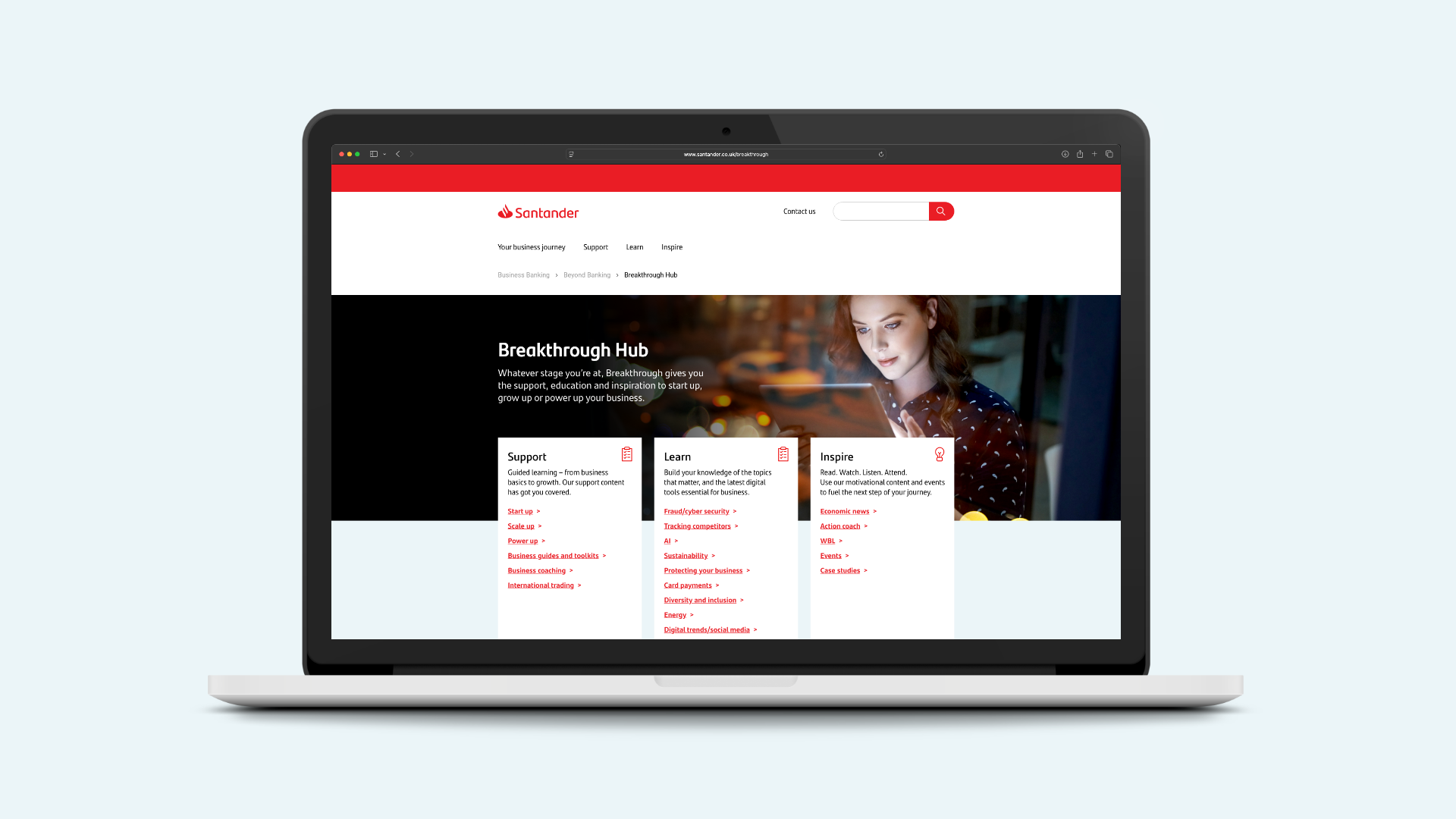
Breakthrough is a knowledge hub for business owners, designed to be a one-stop shop for guides, advice and insights for people running a business, no matter what stage their business is at.
The BRIEF:
Santander’s Breakthrough platform’s original user journey felt disjointed, while also not working hard enough to provide a user with valuable content quickly.
The platform needed an overhaul that made navigation easier, with a more visually impactful content presentation.
getting started
The first step was to do an audit of Santander’s existing platform.
This meant navigating my way through the current user journey from multiple entry points to identify what I thought was working and what immediately offered room for improvement.
Using Miro, I annotated the existing pages with notes on identifiable pain points to collate findings and present back to the client.
Working with McCann’s Customer Experience Director, we ran a workshop with the client to establish next steps, understanding specific client goals and agreeing on solutions that could tackle the challenges both parties were looking to address.


Best in class and category
The research phase was a really interesting one. It helped me gain some useful insights into how I could consider user navigation with a broad volume of content.
It also highlighted what other banks were doing well, particularly in the context of making a platform feel “live” - something McCann’s Customer Experience Director (his name is Steve, so I’ll just refer to him by name from here onwards) were both keen to deliver.
Santander’s platform had the capacity to house a lot of content, but giving people a reason to keep coming back was also really important to us both.


the implications
Steve led this part brilliantly.
I felt confident in being able to identify challenges, and propose solutions, but Steve was the brains of the operation - compiling our findings into four key task phases; outlining goals and rationale to each task.
These implications and tasks were the result of a lot of open communication with the client.
From my perspective, it was important to understand Santander’s technical limitations - getting to grips with their existing component library, understanding what tools already exist that could help achieve the goals Steve and I had set out.


wireframes and design
Using existing components found throughout Santander’s wider site, I redesigned the user journey to make the experience feel more coherent, easier to navigate, and used insights from the client to split content types into three key user intentions: Support, Learn and Inspire.
These springboards meet the user on the new Breakthrough hub landing page, enabling a user to quickly access content designed for their goals.
I overhauled the Beyond Banking section, which previously served as an awkward way into Breakthrough, now presenting it’s navigation tiles in a way that feels more structured - as well as offering clearer signposting into Breakthrough.
Accordions used elsewhere on Santander’s site also proved useful in reducing the amount a user would have to scroll to reach content further down the page.


phase two
Phase Two was more targeted in its approach.
With Phase One looking to resolve the broader UX and content access challenges, Phase Two looked to solve some quality of life issues to enhance the user experience beyond what was achieved in Phase One.
This included things like an advanced predictive search function, leveraging an existing AI chatbot to help a user find content they’re looking for, a saved articles function and more.


