Volkswagen Group Extended Warranty Customer Journey
Volkswagen Financial Services briefed McCann Milton Keynes (now ‘IPG-X’) to overhaul its customer journey for buying an extended warranty plan. Here’s how I redesigned it from the ground up to make it more accessible.

The BRIEF:
Overhaul the existing extended warranty purchase digital customer journey for Volkswagen Group’s brands.
Deliver a working prototype that makes the journey more accessible, less overwhelming and mobile friendly to win buy-in at a stakeholder level.
A snapshot of the brief for McCann back in 2022
The existing journey
I could see what the old journey was trying to achieve.
It was trying to keep the journey to a single, linear page - and where all the ‘action’ happens (don’t worry, I’ll get to that) happens in one section. I’m referring to the part of the brief that reads “‘get cover’ friction free,” but it became affectionately known as “the problem child page.”
Again… I’ll get to it.
The rest of it just felt like each part of the process could have benefitted from a bit of breathing space to help make the overall experience flow more digestible.
Design system
Using Google’s Material Design kit as a basis, I got to work wireframing and component building - developing a design system as I went for components and type styles, including prototyping things like hover interactions and toggle-states into master components.
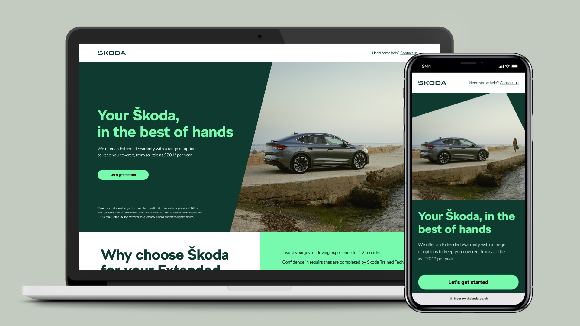
The were initially designed in line with Audi’s digital CI guidelines, before being updated to reflect Volkswagen, Škoda and SEAT.

relationship building
Understanding the client’s needs, building trust and good communication made this job really enjoyable.
I’d already worked with the VWFS team previously on another similar customer journey, so working with the client again on this project having already established a good working relationship - and knowing she wanted to book me again for this was really rewarding.
The client and I were on the same page from the off, sharing ideas and acknowledgements on how the original journey could be improved. This was particularly helpful for understanding specific needs and legal adherences that had to be considered.
I would often reach out to the client directly when looking to resolve specific challenges, rather than go through the account director - but would always make sure the AD was looped in to set expectations like timing and resource availability.

‘The problem child’
This was the page that everything else centred around. There’s a lot going on here, and it was something the user needed to be able to edit on a single page, as the information put in has a direct effect on the outcome.
Making sure that this was easily editable on a single page meant that the user has more agency over their quote without having to jump around the journey to try and adjust the information they’ve input.
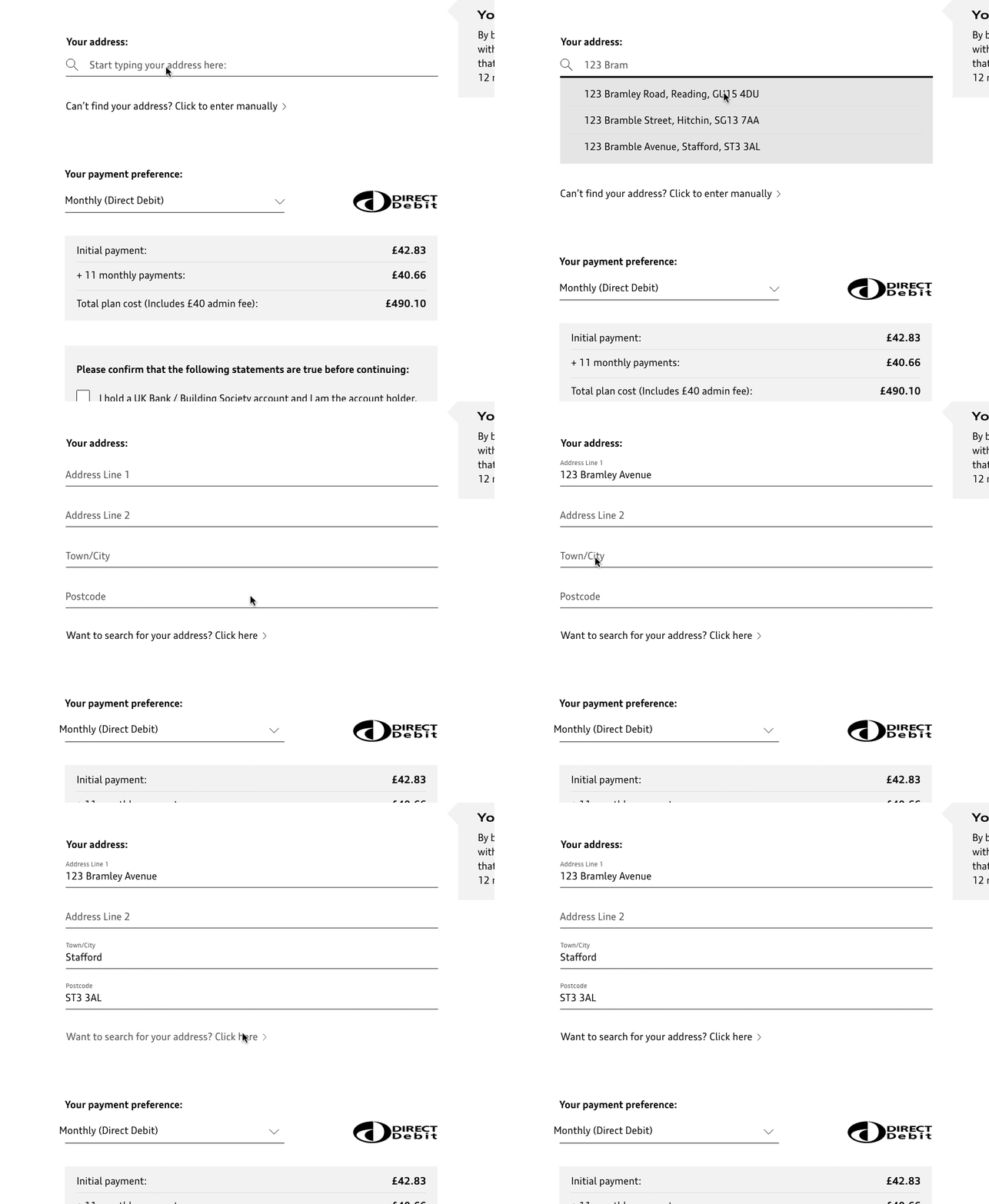
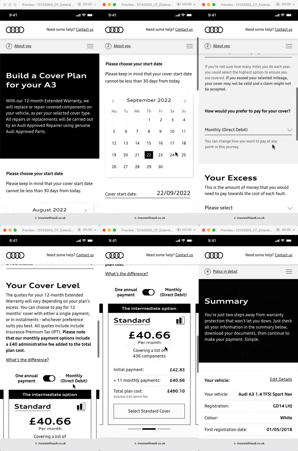
There was a lot of information that needed to be visible when selecting monthly payments. It needed to be easy for a user to see both monthly and annual quotes, as well as what the impact would be when raising or lowering an excess on the policy.
Here’s a GIF showing the prototyped flow of this page working on mobile:

prototyping
I really enjoyed prototyping this. I’d gained almost four years’ experience using Adobe XD at this point, so building out a prototype felt like second nature.
I would regularly provide a demo link for stakeholders to have a play around with and provide feedback on as the project continued to develop.

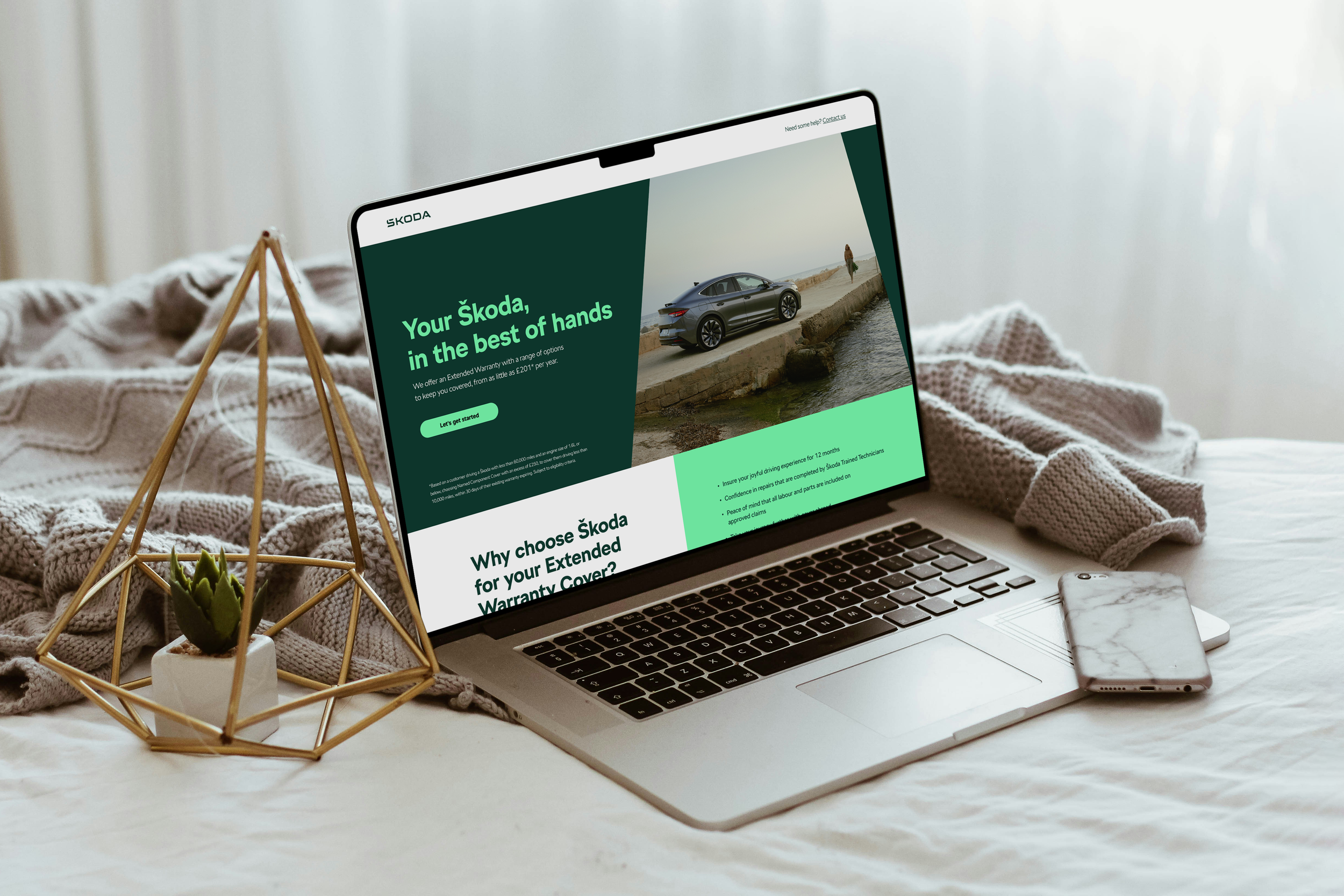
And here's how it turned out
〰️
And here's how it turned out 〰️


